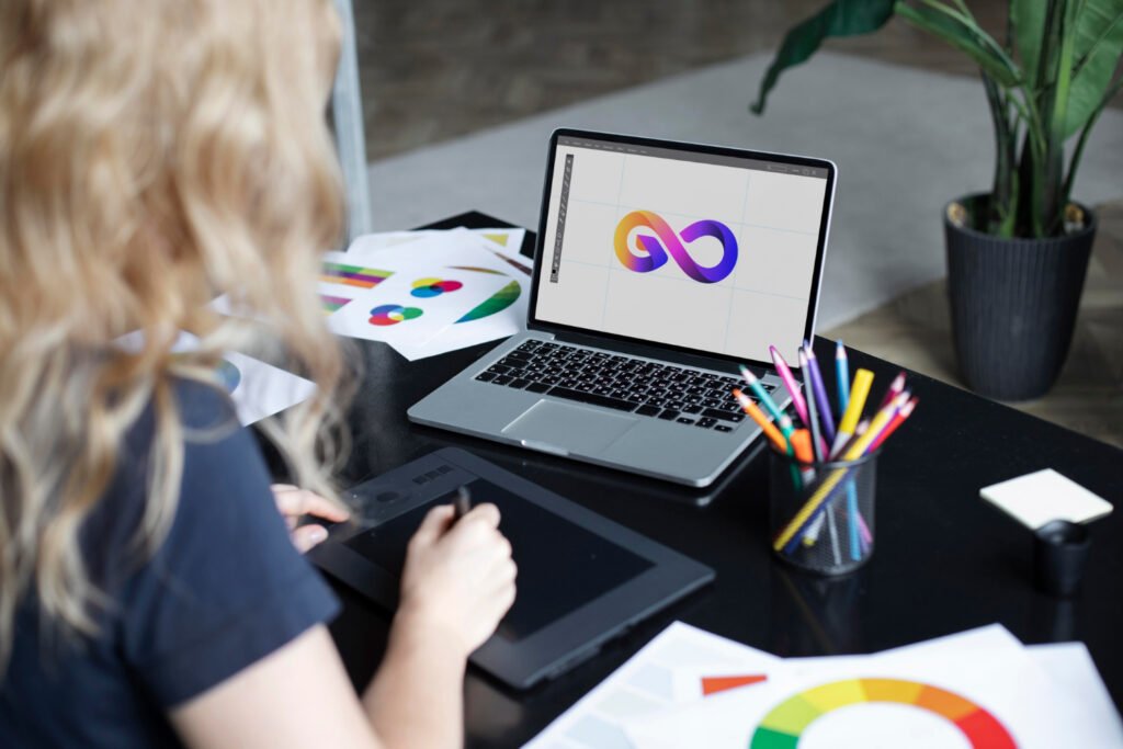
Your logo is not just “pretty”: it is a silent salesperson. If it does not connect, creates confusion, or gets lost in the feed, you are leaving money on the table. This guide will help you decide whether it is time to give it a refresh.
Quick summary 🧭
- If your logo is unreadable at a small size, changes color depending on who prints it, or looks different across every channel, it is time to update it.
- A good logo clarifies who you are, sets you apart, and improves conversions (clicks, bookings, and sales).
1) It looks different everywhere 🎭
Typical signs: inconsistent colors, different versions on social media, and “similar” materials created by multiple providers.
Impact: trust decreases; people do not recognize you.
Clear sign: if more than two versions are in circulation, it is time to organize your brand.
2) It does not work at small sizes 📏
Typical signs: it becomes unreadable as a favicon or on WhatsApp or Instagram; fine details disappear.
Impact: you lose visibility where people see you the most (mobile devices).
At-home test: view it at 24×24 px; if it is not recognizable, it needs to be simplified.
3) It relies on effects to “look good” ✨
Typical signs: shine, gradients, and shadows; without effects, it looks weak.
Impact: expensive printing and poor readability on real materials (embroidery, vinyl, and stamps).
Golden rule: if it does not work in one color, it is not ready.
4) It does not represent your customer or your value proposition 🎯
Typical signs: “it feels generic,” “it could belong to anyone,” or people ask what your business does.
Impact: lower brand recall and a weaker closing rate.
Check: does your logo communicate your industry and differentiator in one second?
5) It is “outdated” ⏳
Typical signs: overused fonts, outdated styles, or trends from 10 years ago.
Impact: people perceive you as outdated, expensive, or unreliable.
Note: updating does not mean changing everything; sometimes a typography and color refresh is enough.
6) There is no brand system (only a JPG) 🧩
Typical signs: there are no horizontal or vertical versions, clear-space rules, color palette, or prohibited uses.
Impact: every design looks different; the team wastes time and money.
What is missing: a master logo and variations, a basic brand guide, and editable files (AI/SVG/PDF).
60-second mini checklist ✅
Mark yes/no:
- Is it readable at 24×24 px?
- Does it work in one color?
- Do you have versions for light and dark backgrounds?
- Does it look the same on your website, Instagram, and invoices?
- Does your logo communicate your industry in one second?
- Is there a 1–4-page brand guide?
- Does the team have the editable files?
- Was the last update less than five years ago?
- Does your ideal customer feel represented?
- Does it distinguish you from local competitors?
Result: If you marked “no” three or more times, a refresh is recommended—or a rebrand if your strategy has changed.
Before / After (quick ideas) 💡
- Before: a logo with three gradients and an extremely long slogan.
After: a simple symbol + strong wordmark; the slogan is used only on larger materials. - Before: different colors in every print.
After: primary and secondary palettes with CMYK/RGB/HEX codes and real-world testing. - Before: only a JPG from the designer.
After: a complete package (AI/SVG/PDF/PNG), favicon, social media version, and a short brand guide.
A stress-free update process 🛠️
- Express assessment (30–45 min): business objectives + visual audit.
- Creative direction: mood board and 2–3 creative territories.
- Proposals: 2–3 directions with real applications (website/social media mockups).
- Fine-tuning: typography, color, and spacing.
- Professional delivery: variations, favicon, templates, and brand guide.
Common mistakes that hurt sales ❌
- Changing the logo for every campaign.
- Using unlicensed fonts.
- Taking a symbol from an icon library and simply “pasting it in.”
- Not testing it on embroidery, vinyl, and avatars before approval.
Shall we review it together? 🤝
At Cuernosoft, we refresh or rebrand your identity without losing the essence of your business. We provide editable files, a brand guide, and templates so your team can create consistent materials from day one. Click here to schedule a consultation
