One thing that has characterized TikTok since its launch in 2016 is its recognizable logo. It has remained almost unchanged over the years, with only slight variations. In this article, you will learn more about its meaning and evolution.
What the TikTok logo means
The short video platform owned by ByteDance has a highly recognizable logo internationally that has undergone very few changes since its creation.
The TikTok logo was created in 2016, although interestingly, the identity of the designer is unknown. It is a logo that has hardly changed since it was launched, except for a few minor tweaks.
The recognizable emblem represents a white musical note on a black background (which switches to a black note on a white background when necessary).
Cyan and fuchsia accents are added to give a sense of movement and a kind of 3D effect.
Meaning of the musical note and the colors of the TikTok logo
The musical note may have been chosen precisely to reference music and art, aspects that are so relevant on the social network, although it also serves as a reminder of Musically, the app that TikTok acquired in 2016 for its global expansion.
On the other hand, vibrant colors like cyan and fuchsia, which stand out against the black background, may have been inspired by the flashing lights at concerts. It is said that the creator was inspired by rock concerts, which he loves, specifically by the atmosphere that arises around the stage when the lights come on.
Also, if we look at the name of its Chinese version, Douyin, we see that the name was not chosen by chance. It means “shaking sound” or “trembling music.” “TikTok,” for its part, means something like “shaking the music,” which in both cases reminds us of the musical character of the platform.
Evolution of the TikTok logo: from the beginning to the present

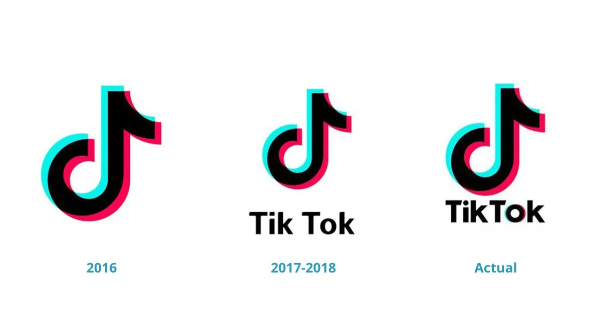
Since its beginnings in 2016, the musical note has been present in the TikTok logo as the only element. In fact, it is the key to the logo and has hardly changed.
The following year, in 2017, the name of the platform was added below the musical note, something that would enhance brand recognition. The words “Tik” and “Tok” were added with a space between them and with a typeface characterized by less clear and marked angles.
In 2018, a new typeface was introduced, which helped improve the readability of the app’s name. This can be seen in the dot of the “i,” where the square shape was replaced by a circular one. Another detail was the distance between the two words, now much smaller, which apparently gives the impression of being a single word, “TikTok.”
In 2023, as the latest change, TikTok replaced the Proxima Nova font with its own: TikTok Sans. A new font that not only further improves readability, but also the user interface and multilingual support.